OATOLOGY
Print-ready packaging design optimized for Amazon, alongside comprehensive brand guidelines for seamless brand consistency.
Year
2024/2025
Client
OATOLOGY
Growth Stage
Pre-Seed
Industry
D2C

-
OATOLOGY approached us at the very start of their journey, recognising a gap in the market for a product that made breakfast prep effortless. Their debut creation—the OATOLOGY overnight oats jar—was designed to do just that.
With their logo already in hand, they needed supporting branding to develop a full visual identity and bring their packaging to life. The challenge was to create print-ready packaging optimized for both Amazon listings and stand-alone retail, along with comprehensive brand guidelines to ensure seamless application across all touchpoints.
-
We built this project from the ground up, first expanding their existing logo into a full-fledged brand identity, then using it to guide the visual direction of the packaging.
Through discussions, questionnaires, and workshops, we gathered key insights to strategically distil the essence of OATOLOGY into a clear, compelling identity tailored to their target audience.
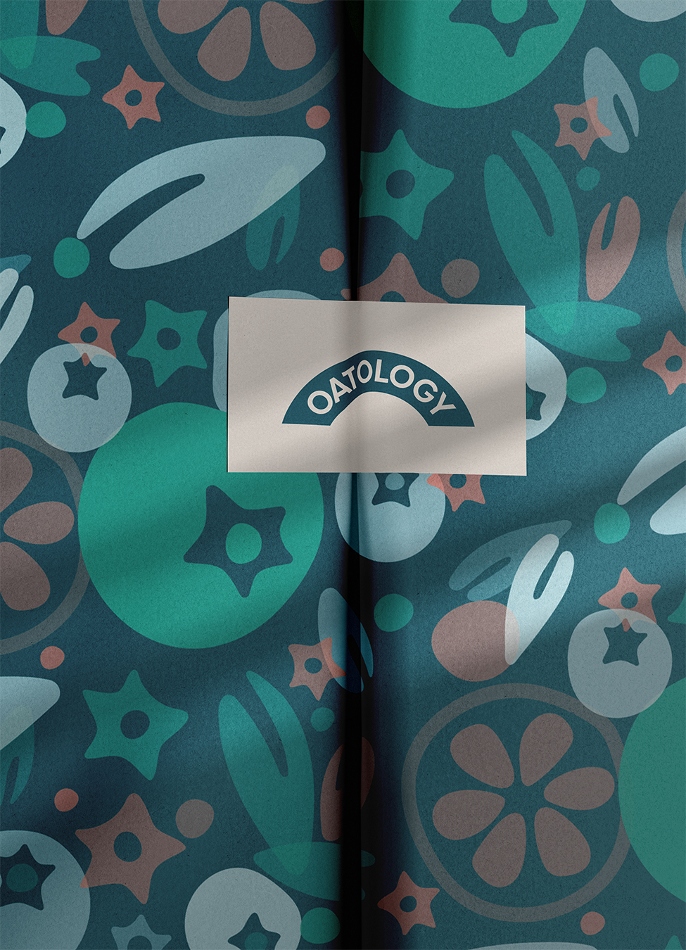
Every design choice was intentional. The colour palette was inspired by nature—deep blues and greens, complemented by bursts of berry red and a warm ‘oaty’ beige. A chunky, organic sans-serif typeface was selected to reflect the brand’s simple, trustworthy product design. For added character, we introduced a loose, abstract pattern inspired by key elements of the product itself.
With the brand identity established, we turned our focus to packaging design. The challenge was to balance essential copy, callouts, and technical information with a visually cohesive and engaging design.
To bring the product story to life, we created a custom illustration that captured the aspirational and effortless nature of the OATOLOGY experience. A cross-section of the jar—filled with yoghurt, oats, and vibrant berries—was designed in the brand’s signature style to showcase both the product’s functionality and its lifestyle appeal.
-
The ultimate overnight oats jar now comes in packaging that is not only on-brand but also visually striking, seamlessly blending bold illustrations, key callouts, and an effortless wellness aesthetic. Designed to captivate and inform, the box maintains a perfect balance between brand storytelling and regulatory compliance.
The response? The first run sold out within weeks—stay tuned for the restock!


Anup Desai - Founder & CEO